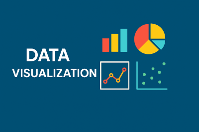
Course description

In the digital age, data alone is not enough—how we present it makes all the difference. This course on Data Visualization equips learners with the skills to convert complex datasets into clear, engaging, and insightful visuals that drive better understanding and smarter decisions.

You will explore the principles of effective visualization, learn to select the right chart types, and master tools like Microsoft Excel, Tableau, Power BI, and Google Looker Studio. Through hands-on projects and real-world case studies, you'll learn how to design dashboards, visualize trends, highlight outliers, and communicate stories hidden in data.

By the end of the course, you’ll be able to turn raw data into visuals that inform, persuade, and inspire.

What will i learn?

  • By the end of this course, learners will be able to: Understand the fundamentals of data visualization – Explain the role and importance of visualizing data in decision-making.
  • Choose the right chart types for different data scenarios – Identify when to use bar charts, line graphs, pie charts, scatter plots, heatmaps, and more
  • Apply principles of effective visual design – Create visuals that are clear, accurate, and compelling.
  • Use popular data visualization tools – Build charts and dashboards using tools like Microsoft Excel, Tableau, Power BI, and Google Looker Studio.
  • Create interactive and dynamic dashboards – Design dashboards that allow users to explore data and gain insights in real-time.

Requirements

  • Basic Computer Literacy – Familiarity with using a computer, browser, and common software like Excel or Google Sheets.
  • Internet Access – A stable internet connection to stream video lessons and access web-based tools.
  • Access to Visualization Tools (Free or Trial Versions) – Microsoft Excel – Tableau Public – Power BI Desktop – Google Looker Studio (free with Google account)
  • Curiosity and Willingness to Learn – No prior experience in programming or data analysis is required—just a keen interest in presenting data visually and effectively.

Frequently asked question

This course is ideal for students, beginners in data analytics, professionals from non-technical backgrounds, and anyone who wants to learn how to communicate data effectively through visual means.

No coding experience is required. The course begins with the basics and gradually introduces more advanced concepts using user-friendly tools like Excel, Tableau, and Power BI.

You will gain hands-on experience with leading data visualization tools, including: Microsoft Excel Tableau Power BI Google Looker Studio (formerly Data Studio)

Apoorva Bajaj

₹399

₹999

Lectures

0

Skill level

Beginner

Expiry period

Lifetime

Related courses