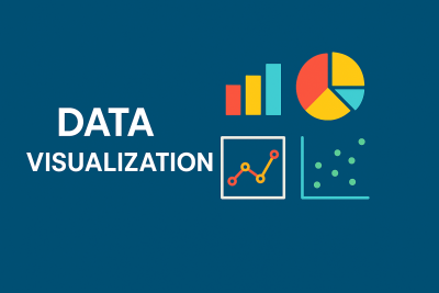
Data Visualization
Data Visualization is the graphical representation of data and information using charts, graphs, and interactive visuals. This course introduces students to essential visualization tools and techniques that help in understanding complex data, identifying trends, and making data-driven decisions. Students will learn how to create impactful visuals using real-world datasets and develop skills in tools like Excel, Tableau, and Python libraries.

English
Last updated
Wed, 05-Nov-2025